- Currency pair: All charts depict the Australian Dollar against the US Dollar (AUD/USD).
- Timeframe variation: The charts show different timeframes, offering a multi-perspective view of the currency pair's behavior – crucial for comprehensive analysis.
- Key levels: Horizontal lines and other indicators highlight potential support and resistance levels.
- Indicators: Various technical indicators are used, including Bollinger Bands, Moving Averages, and Oscillators, to provide insight into momentum, volatility, and overbought/oversold conditions.
Detailed analysis of each chart
Short-term analysis: Potential breakdown below key support

A shorter timeframe focusing on recent price action.
Horizontal Red Line: This acts as a significant support or resistance level, with the price having interacted with it multiple times. The red arrow points to a recent downward move, suggesting bearish momentum. The last few candlesticks show a struggle to remain above the red line, culminating in a notable bearish (downward) move. The price has been consolidating around the red line. The recent bearish move indicates a potential breakdown of support, suggesting further downside movement. The inability of the price to sustain above the red line highlights selling pressure. Traders might look for short (sell) opportunities if the price breaks further below the red line, which then becomes a key level to watch. A confirmed break below this level could signal further declines.
Medium-term analysis: Trendline under pressure amidst volatility
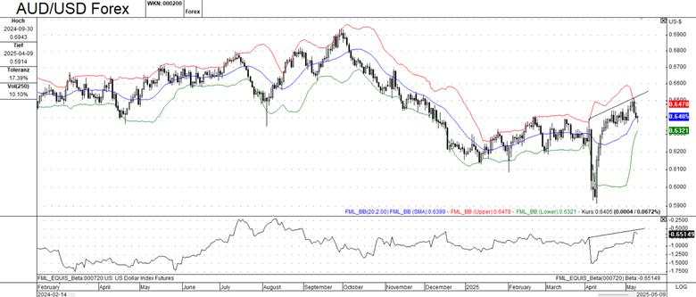
This chart shows a longer timeframe, daily, spanning several months. The red and blue lines are Bollinger Bands, used to measure volatility. A rising trendline is drawn, indicating an upward trend in the recent past. The bottom pane displays the Beta for US Dollar Index Futures, showing the inverse correlation between the USD and AUD/USD (i.e., when the USD strengthens, AUD/USD tends to fall).
The price has been generally trending upwards, as indicated by the trendline. The Bollinger Bands illustrate periods of higher and lower volatility. The recent narrowing of these bands may precede a significant price move. The beta US Dollar Index shows a recent upward move, which correlates with the recent downward pressure on AUD/USD. The price is currently near the upper Bollinger Band.
Traders should watch for a potential reversal. A break below the trendline and the middle Bollinger Band could signal a potential trend change. The beta US Dollar Index is a crucial factor to consider; further strengthening of the USD could put more downward pressure on AUD/USD.
Medium-term analysis: Overbought conditions signaling potential pullback
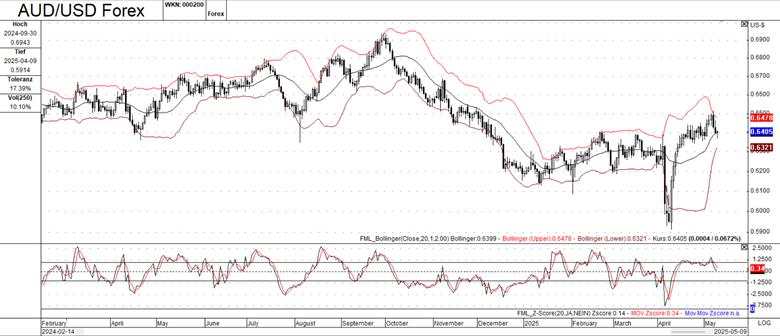
Similar to Chart 2, this is a medium-term view. Bollinger Bands are again used to assess volatility. The bottom pane shows the Z-Score oscillator, which measures how far the price is from its moving average in terms of standard deviations. Readings above 2 or below -2 are often considered to indicate overbought or oversold conditions, respectively. The price action is broadly similar to Chart 2, showing an upward trend and interaction with the Bollinger Bands. The Z-Score oscillator indicates that the price has recently entered overbought territory (above 2), potentially suggesting a pullback or consolidation. The overbought Z-Score reading supports the idea of a potential reversal or pullback. Traders should look for confirmation signals, such as bearish candlestick patterns or a break below key support levels.
Medium-term analysis: Bearish sentiment emerging near resistance
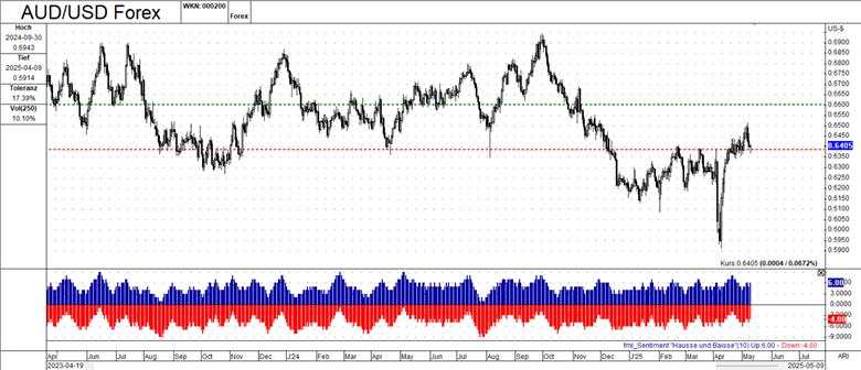
Medium-term, like Charts 2 and 3. The horizontal Green Line acts as a resistance level. The bottom pane displays a sentiment indicator that shows bullish (blue) and bearish (red) sentiment. This helps gauge the market's overall bias. The price has been moving upwards and is currently below the green resistance line. The sentiment indicator reveals a mix of bullish and bearish sentiment, suggesting some market uncertainty. More recently, sentiment appears to be shifting bearish. The green line is a key resistance level; a break above it could signal further bullish momentum. The shifting sentiment towards bearishness warrants caution for bullish traders. If the bearish sentiment strengthens, it could lead to a price decline.
Overall analysis and summary
By combining the information from all four charts, a more comprehensive picture emerges:
AUD/USD has been in an upward trend but is showing signs of potential weakness. The recent bearish price action on the short-term chart, the overbought Z-Score, and the shifting sentiment towards bearishness raise concerns about the sustainability of the uptrend.
The strength of the US Dollar will continue to be a major driver of AUD/USD. Changes in market sentiment can lead to rapid price swings. The Bollinger Bands suggest that a significant price move could be imminent.
If the price breaks below the short-term support (red line), a more substantial downtrend could develop. A strengthening US Dollar would support this scenario. If the price can break above the resistance levels (green line, the upper Bollinger Bands) and bullish sentiment returns, the uptrend could resume.
Key takeaways:
- Short-term analysis suggests potential downside pressure if key support levels are broken.
- Medium-term indicators show a weakening uptrend and increasing bearish sentiment.
- Monitoring the US Dollar Index and overall market sentiment is crucial for AUD/USD trading decisions.
作者:FxPro Traders Research Team,文章来源FXStreet,版权归原作者所有,如有侵权请联系本人删除。
风险提示:本文所述仅代表作者个人观点,不代表 Followme 的官方立场。Followme 不对内容的准确性、完整性或可靠性作出任何保证,对于基于该内容所采取的任何行为,不承担任何责任,除非另有书面明确说明。


暂无评论,立马抢沙发